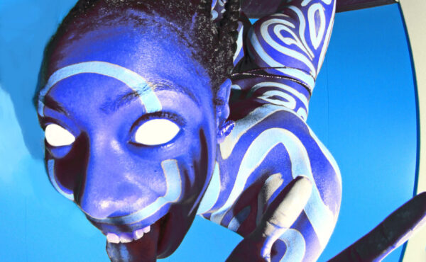
Inna Kochkina, ‘Grapho’
‘Typography is not just a tool that simplifies our reading’ – in conversation with Inna Kochkina
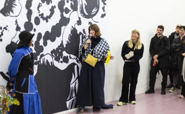
Since the beginning of 2022, a variety of experimental fonts have been featured in the magazine of Metropolis M. With this series of interviews, we shed light on the design practices and innovative ideas behind these typefaces. Today: Inna Kochkina, whose font Grapho was featured in Navigator (#1/2023), tells about her feminist, anarchist typographic practice. ‘It is exciting to see how typography is used to voice resistance and disagreement.’
Elisabeth Klement picked your typeface Grapho to feature in a recent issue of Metropolis M magazine. I thought this would be a good starting point for our conversation. Could you tell me more about it?
‘I started the design of the typeface in 2017 as a part of my graduation work at the Gerrit Rietveld Academy. It was a pretty big project that involved researching handwriting and the ways we use our bodies to write. The focus of this wasn’t simply on our hands but rather on the way we incorporate our whole body when we write. I made a series of prints using an ink roller as a writing tool. When you write with a pen you have a set way of forming letters that you were taught in school. To use the ink roller I had to invent my own system of forming letters based on the rotations my body can make. The tool determined the writing rhythm.’
So these physical prints were the starting point for what would later end up being a digital font?
‘Yes, after the prints were made, I then proceeded to digitize them and used code to connect each letter. It was an interesting process getting it from an analog to a digital state. It raised questions about how you transfer analog qualities into a digital type. It ended up being quite experimental. The project combined some of my main interests, such as alternative or non-traditional ways of writing and printmaking.’
The typeface is, as you say, experimental. Was the legibility of the font a concern for you?

Inna Kochkina, 'Grapho'
‘Not in this project. I find it more important to work with a self-made and independent approach to writing, which I consider resistant to the “ common” or “traditional ” typographic fundamentals established by men over centuries. I’m interested in working with avocational, philistine typographical examples that vocalize minorities or intervene with social and political ideas. In my opinion, this makes writing and language more individual, diverse, and inclusive. So legibility was not my priority here. Instead, I was focused on questioning traditional rules and methods of type design.’
‘Legibility was not my priority here. Instead, I was focused on questioning traditional rules and methods of type design’
What are these methods?
: ‘I see typography simply as the visualization of our language. Traditional type design is based on writing with a quilt or pen, so most of its rules are based on that. In my work, I try to look for alternative ways to represent our language. For example, if we look back at calligraphy, it is all about perfection – making the most beautiful letters. Even now at school, you learn the “correct” way to form letters and you are punished if you don’t do it accordingly. Historically typography is based on these rules of perfection, which makes it inherently exclusive. “ Imperfect” writing can also translate anxiety, fears, or even physical or mental characteristics. I like to work with these imperfections and give them validity. Commercial or traditional typography is used as one of the tools of capitalism and working with alternative typefaces that have different meanings and ideas behind them questions the subject of capitalism. Typography is not just a tool that simplifies our reading. There is so much more behind it that needs to be uncovered.’
You do a lot of typographical research. Could you give an example of something you have been uncovering?
‘For the last few years, I have been working on a project that looks at the connection between typography and politics, particularly focusing on Old Cyrillic letterforms and how their use rose with the rise of Slavic nationalism. At the beginning of the 18th century, a lot of reformations happened in Russia and they became more European-focused. Dutch printmakers were commissioned by Tsar Peter, the first to modernize the Russian script. It is interesting to think that the people responsible for the redesign knew very little, if not nothing, about the language they were working with. As a result, modern Cyrillics started to look way closer to the Latin script than they did before. The redesign was done for a good purpose. It made Cyrillic more suitable for means of mass production such as newspapers and books. After the new type was introduced, the old type became obsolete and was mainly conserved for religious purposes.’
How do you research this history?
‘The research consists of written texts, interviews, and visual work that will be put together in a book. I work with a found archive of traditional Cyrillic from the 15th century that consists of poorly documented examples of traditional Slavic script. I study these old characters through a photogram-making technique that helps me to preserve distorted characters and remake them into new letter shapes. I aim to develop a font that can exist in feminist and decolonial contexts and rethink the typographic style that is so strongly associated with nationalism and hate.’
It seems like the conversation of typography and (de)colonization has become very relevant again.

Inna Kochkina, research into Cyrillic typeface
‘Yes, I think looking at script and typography from a decolonial perspective is crucial. I am interested in working with Old Cyrillic because it helps me to see how typography is used to claim colonized or occupied territories. For example, old Cyrillic typefaces are applied to the flags of the Russian-occupied Ukrainian territories. If you take a close look at the flags of the quasi-republics DNR, LNR, Novorossia, and flags of nationalist Russian organizations, they all use the traditional Cyrillic typeface in combination with a two-headed eagle, the symbol of the Russian Empire.
A similar mechanism exists in the regions of the Russian Federation that historically used different scripts or languages. In the 1930s all languages that existed in the Soviet Union went through cyrillization. Such change was meant to simplify writing and education, but in reality, it was done for the domination of the Russian language for ideological and political purposes. This has strongly affected languages that used different writing systems. For example, Tatars who were writing in Arabic, Burtyats who used Mongol bichig, or Yakuts who didn’t have a writing system at all, all of a sudden they had to adapt their languages to the Cyrillic script. All these scripts were not just writing tools, they also carry the identity, history, knowledge, religion, and many more aspects of the culture. All of a sudden these languages had to inherit new scripts along with their historical background and cultural codes. Nowadays traditional Cyrillic script is strongly associated with Slavic identity and has often been used in these regions for patriotic purposed to force the “Russian identity” and support the government’s agenda of restoring the empire, whether it relates to the pre-1917 Empire or the scale of USSR.’
‘I see a counter-movement, of how traditional Cyrillic is also being used by feminist or anti-colonial activists’

Inna Kochkina, research into Cyrillic typeface

Inna Kochkina, research into Cyrillic typeface
Do you see a future for traditional Cyrillics that isn’t political?
‘No. But I see a counter-movement, of how traditional Cyrillic is also being used by feminist or anti-colonial activists. For example, Pussy Riot is one of the main references in my work. They use traditional Cyrillic in their music videos and merch. I think that this way they address their criticism of corrupted government and institutions such as the Russian Orthodox Church and at the same time, they reclaim this typographic style, which is a large part of Russian cultural heritage. It is exciting to see how typography is used to voice resistance and disagreement.’