De canon verandert, maar hoe? En hoe snel? – The 25 Sculptures That Define the Modern Age
Op uitnodiging van The New York Times kiezen vier kunstenaars en een curator hun 25 belangrijkste beeldhouwwerken van na de oorlog. Het levert een interessant zicht op hoe de canon verandert, langzaam, want de Zwarte kunstenaars in het gezelschap moeten nu en dan hard duwen om de keuze te laten afwijken van het ingesleten, reguliere pad. Maar de lijst omvat relatief veel vrouwen en kunstenaars met een diverse culturele achtergrond. Helaas voor de Europeanen doet Europa op it New Yorkse lijstje niet mee. Afgezien van wat import-Amerikanen staat alleen Isa Genzken op de lijst.
Om de 25 belangrijkste beeldhouwwerken te selecteren die sinds 1945 zijn gemaakt, heeft The New York Times in maart een panel van deskundigen uitgenodigd in het gebouw van de New York Times. Tot dit panel behoorden de kunstenaars Firelei Báez, 45; Charles Gaines (82), Adam Pendleton (42) en Arlene Shechet (77) — die elk in hun werk, in verschillende mate, de beeldhouwkunst hebben verkend en verder hebben ontwikkeld —, evenals Ruba Katrib (44), hoofdconservator van MoMA PS1 in Queens en voormalig conservator van het nabijgelegen SculptureCenter, het enige museum in New York dat zich expliciet aan dit medium wijdt.
De krant relativeert het belang van de lijst. In de intro staat geschreven dat de lijst uiterst subjectief is en met een flinke dosis scepsis moet worden bekeken: ‘een andere groep zou tot andere keuzes zijn gekomen, en het is goed voorstelbaar dat de volgende lijst er anders had uitgezien als dezelfde groep op een ander tijdstip op dezelfde dag bijeen was gekomen.’
De lijst is geen ranglijst, slechts de volgorde waarin de werken zijn besproken. De korte fragmenten uit de discussies zijn het leukst om te lezen. Ga voor e hele lijst met foto’s naar The New York Times HIER
De lijst:
Arlene Shechet: Can you go over what the question is again?
M.H. Miller: We’re trying to think about the most important works of sculpture since the end of World War II. The only constraint is that they have to be made post-1945.
Shechet: I feel like we need to define whether we’re choosing based on artists and their careers versus individual artworks.
Charles Gaines: There’s no way in the world I can think of an individual work, because I’m thinking about the body of work that person has done.
Adam Pendleton: In focusing on specific works, I think you naturally think about the rest of the artist’s work. Great works don’t just drop out of the sky.
Ruba Katrib: I think a lot of the works that we’re going to bring up — the ones we think are really important — may not be known by, let’s say, a broader public anymore. I feel a lot of pressure.
Firelei Báez: So, are we considering a work’s global impact as the main justification for deeming it “important”?
Miller: I think “important” means important to you.
Báez: So it’s absolutely subjective? Oh, no!
Miller: Well, however you define “important” for yourself in this conversation is how you define it. I think we should just start with this first work that you picked, Arlene.
1. David Smith, “Hudson River Landscape,” 1951
Coined in 1946 by the art critic Robert Coates, the term “Abstract Expressionism” tends to conjure the work of Jackson Pollock and Willem de Kooning. But those midcentury American painters had a counterpart in David Smith, who brought the movement into three dimensions with steel sculptures that were similarly gestural and introspective and without a central focal point. Smith was a skilled welder — he worked at the American Locomotive Company during World War II building tanks and tank destroyers — though he’d studied painting at New York City’s Art Students League in his youth. That training is evident in his midcareer work “Hudson River Landscape,” which portrays the sort of pastoral vista that had historically been the purview of painters. Measuring about six feet long and four feet high, with a depth of nearly 18 inches, the sculpture was based on the passing countryside Smith saw on the train journeys he made through upstate New York, where he and his first wife, the artist Dorothy Dehner, bought a farm in 1929. The lines of “Hudson River Landscape,” now in the collection of the Whitney Museum of American Art, form what can be interpreted as a constellation of steps, railroad tracks, clouds, streams and mountains. But the work rejects mass in favor of openness, with each length or squiggle of metal doubling as a boundary, and the work as a whole acting as a fragmentary frame for wherever it’s placed. — Rose Courteau
Shechet: When I came up in art history, David Smith was known as the father of American sculpture. I’ll speak up for him because he’s actually the result of World War II. He learned arc welding in order to contribute to the war effort. Before the war, aside from Julio Gonzalez’s work with Picasso, sculpture was all casts, and it was very figurative. David Smith opened sculpture up to the idea of drawing in space with metal.
2. Lygia Clark, “Bichos,” 1959-66
Most art isn’t meant to be touched, but Lygia Clark’s “Bichos” don’t really become art until they are in a viewer’s hands. Between 1959 and 1966, the Brazilian artist created these works — which range from the size of a miniature paper crane to that of a stove — out of square and curved aluminum panels connected by hinges. They look like geometric abstract paintings that went through a 3-D printer and sprang to life. Trained as a painter, Clark was a leading member of the Neo-Concrete movement, a group of Brazilian artists interested in how art could reconnect viewers to their bodies. (Later in life, she took her interest in interactivity even further, helping to develop practices in art therapy and psychoanalysis that are used to this day, especially in Brazil.) With these works, which are now in collections of museums around the world, including the Museum of Fine Arts, Houston, and the Centre Pompidou in Paris, Clark sought to share the magic of the creative act with her audience, to “offer ritual to the viewer,” as she said in 1960. Her “Bichos,” the name of which translates to “critters” in English, have no ideal configuration. As viewers manipulate the works, they can feel the cool metal beneath their fingers and hear the joints squeak and clack. — Julia Halperin
Báez: Lygia’s phenomenal.
Katrib: With “Bichos,” the sculpture can be morphed so there’s a sort of indeterminate element, but then it’s also participatory.
Shechet: I think she studied psychology. Touching an artwork, changing an artwork — there’s a certain connectivity about those pieces that I think was radical.
Báez: And the title is “Critters,” so it’s like this Rorschach test.
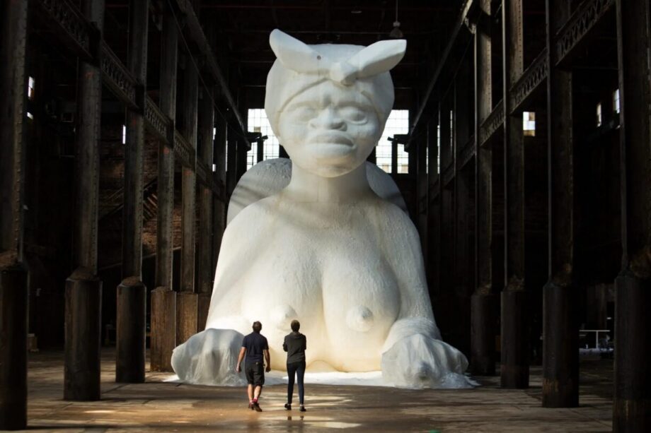
3. Kara Walker, “A Subtlety,” 2014
For nine weekends between spring and summer of 2014, people waited in line for hours for the chance to encounter a 75-foot-long, 35-foot-tall sugar-covered sphinx inside the former Domino Sugar Factory in Williamsburg, Brooklyn. (The sculpture’s title is a reference to “subtleties,” elaborate sugar sculptures served at medieval banquets.) The gargantuan figure was the work of Kara Walker, an American artist then best known for paper silhouettes exploring the depravity of slavery.
Inside the football-field-size space, molasses dripped down walls and a thick, almost putrid smell hung in the air. Greeting visitors were 15 life-size sculptures of loincloth-clad boys, some made of brown sugar, others of resin coated in molasses, which melted over the show’s run. The sphinx’s head, adorned with a scarf, referenced the racist stereotype of the mammy, while her large breasts and exposed bottom evoked the overly sexualized jezebel. In a video for Creative Time, the public art organization that commissioned the project, the artist said that the work reflected on “a slave trade that traded sugar for bodies and bodies for sugar.” “A Subtlety” was the first large-scale sculpture Walker ever made and arguably the first artwork to go viral on Instagram. Following the show, most of the work was destroyed, with only the figure’s left hand remaining, but it lives on through thousands of lewd selfies visitors posted mock-pinching the sphinx’s nipples and pretending to lick her buttocks. For Walker, an artist informed by the history of Black women’s exploitation, that reception was part of the point: her work, she has said, responds to the “mucky and violent” nature of human behavior and “pulls it out of an audience.” — J.H.
Katrib: I feel like if we’re going to talk about a sculpture from the present, Kara Walker’s “A Subtlety” is the work we should probably include, right?
Shechet: Yes, indeed.
Miller: I think “A Subtlety” is one of those things that we’ll be talking about 100 years from now. But Charles, you picked a different Kara Walker.
Charles Gaines: “Unmanned Drone” (2023) [for which the artist broke apart a monument to the Confederate general Stonewall Jackson and rebuilt it as a kind of mythical creature]. It’s probably one of the most impactful sculptures I’ve ever seen.
Pendleton: I would prefer not to do “A Subtlety.”
Miller: What’s the argument against it?
Pendleton: Just on a historical and a personal level, if it’s going to be the one piece of art on this list that has a figurative bent to it — for me there are more interesting ways to represent Kara Walker.
Gaines: In “Unmanned Drone,” she’s doing things she hasn’t done before, and she’s embracing certain ideas of abstract form and political discourse. She’s reaching back into the past and showing us the future.
Shechet: I’m going to argue for “A Subtlety” because I feel like … New York is a community, and every once in a while, somebody makes a gesture that makes the community come together. And “A Subtlety” did that.
Miller: It’s true that people don’t usually line up to see a work of art.
Pendleton: But I don’t think it made people come together in a very sophisticated way.
Báez: I remember living two blocks from the Domino Sugar factory and getting in line, and my roommate’s mom had gone on disability because she went crazy working in that factory. And the fact that you could go in there, into this place with such a strong history, and people were posing under the breasts trying to catch the nipples. You saw the facile way people consumed this very heavy history.
Shechet: I think she reveals a lack of sophistication in us.
Pendleton: That’s what everyone always says about her work. I think that’s the most ridiculous argument.
Shechet: She’s doing something provocative. And by provoking, there’s going to be a mixed response. Some people will get it, some people won’t.
Pendleton: But is it provocative? What’s provocative about it? I want someone to tell me this.
Shechet: I think this work is uncomfortable. And some people don’t know how to be uncomfortable.
Pendleton: I think it’s simplistic, personally. Politically simplistic. Aesthetically simplistic. All the readings of it are all so blatantly obvious to me.
Shechet: I think it’s radical.
Gaines: It’s a radical spectacle. And I’d say an extraordinary spectacle.
Pendleton: I think it’s a continuum of expectations around representation when it comes to art made by Black people. That’s what I see.
4. Claes Oldenburg, “The Store,” 1961
The Swedish-born sculptor Claes Oldenburg rose to prominence at a moment of transition and experimentation in the New York art scene. As Abstract Expressionism was starting to feel stale and Andy Warhol’s shiny, optimistic brand of Pop Art had not yet fully emerged, Oldenburg introduced “The Store,” an early example of installation art and interactive sculpture. The artist transformed an 800-square-foot storefront on East Second Street into a functioning shop and a working studio. He even created stationery for the business, which he called Ray-Gun Manufacturing Company. Oldenburg spent his off-hours creating an inventory out of papier-mâché, wire and various fabrics. He laid out rumpled shirts and ties, hung oversize Pepsi-bottle caps on the wall and stocked pastry cases with slices of pie — all colored with commercially available paints. The artist’s lumpy, gloopy approximations of the wares on sale at neighboring bodegas and hardware stores collapsed not only the line between painting and sculpture but also that between consumer culture and high art. Unruly and caustic, they captured a darker side of what would come to be recognized as Pop Art while acknowledging art as a commodity and catering to the collecting elite coming from uptown. As Oldenburg put it in a 1985 interview, “Instead of paying a normal price for a loaf of bread, they would pay ninety-nine dollars for it.” — J.H.
Miller: I think we should talk about Oldenburg. I nominated “Floor Burger” (1962) and Arlene nominated “Lipstick (Ascending) on Caterpillar Tracks” (1969).
Katrib: I was going to put “The Store,” which to me is more important.
Pendleton: That’s a great work, a great idea.
Shechet: I mean, I love “The Store.” I picked the “Lipstick” because it’s a very early Oldenburg. It’s an antiwar statement. He’s playing around with the idea of the military, poking fun at the men making vertical phallic monuments. I just think he gets so much done.
Báez: It’s the flaccid penis exemplified. It’s Americana around the world.
Gaines: “The Store” is a piece that could have been done yesterday.
Claes Oldenburg Is (Still) Changing What Art Looks Like.
Pendleton: So “The Store”?
Miller: I think “The Store” is arguably more influential in a lot of ways.
Shechet: It was a great breakthrough for downtown artists. … What’s next? Warhol?
Miller: I nominated the “Brillo Boxes” (1964). I was slightly surprised I was the only person who picked Warhol, but I’m happy to hear an argument against Warhol.
Shechet: Warhol’s not as strong as a sculptor. If this was a painting conversation, I would be like, “Of course Warhol.”
Pendleton: Can we talk about Mel Edwards’s “Lynch Fragments” instead?
5. Melvin Edwards, “Lynch Fragments,” 1963-2026
The blades of an open pair of scissors glisten menacingly atop a cluster of interlocking steel scraps, bound by a thick chain and mounted against the wall. One of about 300 small-scale welded steel reliefs in Melvin Edwards’s series “Lynch Fragments,” the stark creation confronts the viewer at eye level like a gnarled head or a nightmarish mask. Edwards, who died this year at age 88, a few weeks after T’s panel met, grew up Black in segregated Texas in the 1940s and ’50s. He was partly inspired by “100 Years of Lynchings,” the journalist Ralph Ginzburg’s 1962 publication on racial violence in America. The year after it came out, Edwards, working in his Los Angeles studio, began welding together industrial and farming tools like railroad spikes, car parts, bolts, nails, gears, padlocks, rakes, hammers and ax heads into these dense, experimental sculptures. They reflected both the politically charged figuration of civil rights-era protest art and the language of formal abstraction without fully belonging to either school. Because they weren’t easy to classify, and because of the prejudice against and segregation of artists of color, their wider recognition was delayed until recently. Many of the works are now in the collections of museums across the country, including those of the Museum of Modern Art and the Met in New York, the Cleveland Museum of Art and the Hammer Museum in Los Angeles. Edwards, who became the first Black sculptor to receive a solo exhibition at the Whitney Museum of American Art in 1970, continued to add to the series throughout his long career. In the 1970s, the works responded to Black Americans being disproportionately drafted to fight in the Vietnam War. Later iterations reflected his increasing engagement with Africa and its anticolonial struggles. — Zoey Poll
Miller: This almost made my list.
Gaines: Yeah.
Katrib: Mine too.
Shechet: And mine, but why didn’t it?
Miller: I think it’s not widely known outside of people who are sculpture aficionados.
Pendleton: It’s a huge series, too, and I think there’s the serial nature of the works, which is why you ignore them.
Gaines: With respect to [Warhol’s] “Brillo Boxes,” I think that work got attention because it kept Marcel Duchamp’s question — “Why is it art?” — going. It’s part of this redefining of the work of art — by taking content out. And at the same time, formal artists like Mel Edwards were producing content-rich work. Content-rich work was not important at the time that Warhol was doing this, and I think that’s a part of the reason one gets more attention than the other.
Katrib: Mel Edwards is more influential now maybe than he was then. The “Lynch Fragments” have entered into the consciousness and people have caught up with them, finally.
6. Marisol, “Women and Dog,” 1963-64
For nearly 60 years, the Venezuelan American artist Marisol incorporated her own likeness into boxy wooden sculptures that combined Pop, pre-Columbian and folk art influences with a deadpan wit. Her inscrutable face — once described by Gloria Steinem as “not more open than a cat’s” — appears painted, sketched, carved in wood and cast in plaster across all sorts of tableaux of conventional life: She dines with herself (“Dinner Date,” 1963) and stands at the altar as both bride and groom (“The Wedding,” 1962-63). In what is perhaps her best-known work, “Women and Dog,” which is owned by the Whitney Museum, she appears, as if waiting for a “Walk” sign, alongside a couple of adult counterparts, one holding a perky canine by the leash, and a young girl. Years before the feminist art movement of the 1970s, these life-size figures offered a mordant if enigmatic portrait of bourgeois American womanhood. Rendered so stiffly they seem imprisoned in their own roughly hewn bodies, the women are at once fashionable, commanding and troublingly exposed, none more so than the central figure, which has a tiny photograph of Marisol on a wooden knob for a head. The child’s sketched-on face is contorted into the kind of subtle grimace that helped distinguish the artist’s work from the emotional flatness of Pop Art as practiced by artists like Warhol, who saw Marisol as a muse. — Z.P.
Katrib: I think there’s a tension between Art History 101 and the need to branch out a little bit. We can’t include everything. Maybe we need to have Marisol Escobar in here because it might be less expected and more exciting to see.
Pendleton: I’d be happy to have Marisol instead of Warhol, for sure.
Miller: What is the Marisol work?
Katrib: “Women and Dog.” It’s really amazing. To me, it covers this moment of women and Pop that was very important and global and idiosyncratic and underappreciated.
Shechet: Way underappreciated.
7. Noah Purifoy, “66 Signs of Neon,” 1966
In August 1965, the Alabama-born Noah Purifoy, the founding director of the Watts Towers Arts Center — a southern Los Angeles arts-education site near the monumental folk-art towers built by Simon Rodia — watched as fires broke out only four blocks away. The weeklong uprising in the predominantly Black neighborhood of Watts, a response to police violence, residential segregation and economic exclusion, consumed entire streets, leaving behind heaps of charred refuse. Afterward, Purifoy and his fellow artist Judson Powell pulled a wagon through the roads, picking up whatever caught their eye: liquefied neon signs, twisted pieces of steel, warped piano pedals, blackened photographs and a lot of burnt wood (which the artist Ed Ruscha said Purifoy used “as a painter might cadmium red”). The pair then transformed these scraps into assemblages with a Dadaist spirit. Purifoy saw the project as a tool for social change and soon invited other artists to make their own found-object works from his three-ton stockpile. The resulting series, “66 Signs of Neon,” comprised 66 pieces (as they were sold, new works were created to maintain this number), including Purifoy’s improvised suit of armor, “Sir Watts,” and his shattered-windshield sculpture, “Sudden Encounter.” A show of the works toured nationally, and many of them didn’t survive, but the artists, at least temporarily, managed to introduce the country to the ethos behind what Purifoy called “junk art,” which, he wrote, “illustrated […] the imposition of order on disorder, the creation of beauty from ugliness.” — Z.P.
Miller: What about Noah Purifoy?
Shechet: I love his work, but I think Betye Saar is a better choice.
Pendleton: I agree.
Katrib: I was going to put Betye Saar down, but then I was also just like, which is the piece?
Shechet: “The Liberation of Aunt Jemima” (1972).
Gaines: Their works are so different.
Katrib: Betye Saar’s work is obviously sculptural, but for me it somehow doesn’t fit. I also think Noah Purifoy dealing with refuse — it’s really loaded, intense material. Junk, but not just junk. It’s very specific junk. That transformative element of material is very apt today because that’s what so many people are doing.
8. Robert Rauschenberg, “Bed,” 1955
Coming up during the mid-1950s, the American artist Robert Rauschenberg was an aesthetic heir to Abstract Expressionism who also delighted in puncturing its solemn, often grandiose aura. After “Erased de Kooning Drawing” (1953), for which he spent weeks rubbing away a drawing he’d commissioned from Willem de Kooning, he created a similarly ambivalent and much-debated homage in the form of “Bed.” One of his earliest Combines — improvisatory assemblages that merged painting, sculpture and collage with mundane and eerie everyday objects — the work recast his own well-worn sheets and a folksy quilt from the artist Dorothea Rockburne as a pointedly intimate canvas. Rauschenberg defaced the bedding and pillow with feverish pencil scribblings and then stained them several times over with unruly, drippy blotches of oil paint in the style of Jackson Pollock. The gestures appeared so violent to some critics that one likened the work to “a police photo of the murder bed after the corpse has been removed.” Rauschenberg, however, didn’t find the work disturbing: Years after its creation, he told an interviewer, “My fear has always been that someone would want to crawl into it.” Either way, “Bed,” now in MoMA’s collection, demonstrated that the boundaries between mediums — and between art and life — had become irrelevant amid the conceptual freedom offered by the postwar art world. — Z.P.
Pendleton: Then what about Rauschenberg? I mean, his sculptures are fantastic.
Katrib: I love his cardboard sculptures.
Shechet: I think Rauschenberg would be a huge omission.
Báez: If we have Rauschenberg, then we need to include Noah.
Pendleton: Why? Why do you say that?
Báez: Because he’s doing assemblage in a different way from Rauschenberg, and with a more generous social construct. I don’t know if we can have one without the other.
Miller: What’s the Rauschenberg?
Katrib: The Combine with the goat [“Monogram” 1955-59] is the most famous work, but I just can’t stand it.
Pendleton: But there are better ones.
Miller: I initially picked “Bed.”
Pendleton: “Bed” is great. Let’s do “Bed.”
Katrib: “Bed” is one of the first contemporary artworks I saw that made me want to get into the art world. I was a teenager, and it was on view at the Whitney, I believe. But I guess I also don’t count it fully a sculpture.
Miller: Painting playing the game of sculpture, right? That’s how Jasper Johns described the Combines.
Pendleton: That’s really nice.
9. Richard Serra, “Tilted Arc,” 1981
To roll, to crease, to twist, to knot, to split: These were among the 84 infinitives that a young Richard Serra gave himself as conceptual catalysts for his sculptures, which incorporated immense plates of steel more commonly seen in shipping containers. With these works, the American artist seemed capable of distorting space itself, in ways both subtle and seismic. After the federal General Services Administration commissioned Serra to erect “Tilted Arc” — a gently lilting 120-foot-long and 12-foot-tall curved steel wall that cleanly bisected Federal Plaza in Lower Manhattan — office workers and residents protested what they viewed as an aggressive, unsightly obstacle to the flow of pedestrians. The length of oxidized rust-covered metal resembled a taut pen stroke when seen from above or from the side but loomed like an impassable border wall to those facing it. A hearing was convened, followed by a lawsuit about free speech and contract law that the artist eventually lost. The case changed the way in which public art was commissioned in America, helping to make community input standard practice and signaling the end of artistic autonomy in shared spaces, much to Serra’s chagrin. In March 1989, as “Tilted Arc” was about to be cut into pieces and hauled to a government parking lot in Brooklyn, Serra declared: “This government is savage. It is eating its culture.” — Z.P.
Miller: Now we’re at Serra. I think we have to pick a Serra.
Shechet: “Tilted Arc.”
Pendleton: I would choose something a little less well known, but I don’t know that that matters.
Miller: I think the whole story of “Tilted Arc” is interesting — how people reacted so violently to that work.
Pendleton: “Tilted Arc.” Done.
Shechet: A miracle. We agreed. That was fast. We’ve already talked about how sculpture has overlapped with painting. This is where sculpture overlaps with architecture.
Báez: I just see the history book that I was taught in school.
10. “Benefit for the Student Mobilization Committee to End the War in Vietnam” at Paula Cooper Gallery, New York, 1968
The New York artists associated with minimalism — which traded the emotional heft of Abstract Expressionism for an interest in form, material, proportion and objectivity — may not seem, in retrospect, like obvious contenders to participate in one of the seminal exhibitions of the 1968 antiwar movement. The benefit at Paula Cooper was not only the gallery’s first show, but the first in SoHo, the neighborhood that would become, until the end of the 20th century, the center of the New York art world. The gallery placed work by the likes of Donald Judd, Sol LeWitt and Dan Flavin in conversation not just with one another, but with the world at large as student protesters from Brazil to Japan rebelled against violence and authoritarianism. Each of these artists would go on to transform sculpture: Judd through his explorations of static objects and their impact on empty space, Flavin through his treatment of color and light as tactile materials and LeWitt through his radical notion that an idea for a work was more significant than the resulting object. (The benefit show featured the first of LeWitt’s wall drawings, which consisted of instructions that someone else would follow to execute the piece.) “A work needs only to be interesting,” Judd wrote in his 1964 essay “Specific Objects,” outlining a stance that at first glance seems determinedly apolitical. But he also insisted, in a 1968 essay, that “the United States is still a hierarchical country […] my work and that of most artists is opposed to that hierarchy.” Art, the Paula Cooper benefit suggested, did not have to be explicitly political to engage with politics; artists, after all, are citizens, too. — Michael Snyder
Miller: I was surprised I was the only person who picked Judd.
Báez: Because again, it’s the same history book underlined.
Shechet: He’s had a lot of influence.
Báez: We’re in this really tender moment in history where everything is falling, literally. We can either amplify the things that led us to where we are, or we can find moments that made escape routes outside of that.
Pendleton: That’s a really good point. But I think there’s enough room on the list to probably include a Judd and find these escape routes.
Miller: Someone make an argument for Sol LeWitt over Judd.
Pendleton: There’s a kind of generosity to LeWitt’s work that I think is often absent from sculptural practice — that lightness and fluidity; there’s a magic to it that’s important.
Shechet: I just feel we’re going down the wrong road with him if we put his sculptures on, because it’s not what he did best.
Pendleton: I don’t agree with that.
Gaines: I don’t either but … we’re just going to have to disagree.
Pendleton: I feel like if we’re not going to have Judd, we have to have LeWitt.
Miller: I don’t think we can just ignore minimalist sculpture entirely. We would look like we don’t really know what we’re talking about.
Shechet: Dan Flavin didn’t even make it onto our lists.
Katrib: He should have.
Pendleton: I think LeWitt had more interesting questions around art in general. … I think Donald Judd’s a great sculptor, but I think LeWitt pushed it a little further than Judd.
Shechet: You’re pushing it!
Pendleton: Judd doesn’t come close intellectually to LeWitt.
Miller: Are LeWitt’s wall drawings sculpture?
Gaines: Well, I don’t know. It’s hard. Sol had a wide practice, but I don’t know how you cannot think of LeWitt as a sculptor. … His whole approach was to make a unified relationship between a paradox — between an object and an idea, merging them into one thing. That still has impact on the way we’re thinking right now.
Miller: I have in my head at all times the comment section of The New York Times. And what we’re going to get is people who are like, “Where is Flavin?” “Where is Judd?” But I think just because it’s expected doesn’t mean we have to do it.
Katrib: Maybe Judd and LeWitt and Flavin just become one entry.
Miller: I mean, they were all in the first Paula Cooper show in ’68.
Katrib: Wait, why don’t we do that? Can we put the show in?
Pendleton: Let’s just do that.
11. Robert Smithson, “Spiral Jetty,” 1970
Three years before his death in a plane crash in 1973, the American Robert Smithson flew west from New York City to Utah to scout a location for a new work in the northern branch of the Great Salt Lake. He found a remote site called Rozel Point, where, working with local contractors, he transformed 6,650 tons of organic material — mostly mud and basalt from extinct volcanoes — into a 15-foot-wide spiral extending 1,500 feet into the lake. “Spiral Jetty” would soon become the emblematic work of the land art movement that had sprung up a few years before when artists like Smithson, Michael Heizer and Nancy Holt, Smithson’s wife and collaborator, urged art out of the gallery and into the open air. Land art led to new explorations in site specificity that defied the all-consuming logic of the art market. But “Spiral Jetty” is also, despite its immovable mass, a work about entropy and environmental degradation. Surrounded by the debris of abandoned oil rigs, it’s been subjected for half a century to the corrosive waters of the Great Salt Lake, which rise and fall to submerge or expose the work, depositing crystals over its surface even as the sculpture itself erodes. “The Jetty,” as philosopher Gary Shapiro wrote in a 2019 essay, “suggests and anticipates its own ruin.” Today, Smithson’s meditation on impermanence has come to read as a parable and a measuring stick for ecological catastrophe. It has only grown more relevant with time. — M.S.
Báez: Why would we not include “Spiral Jetty?”
Pendleton: What about someone like Nancy Holt?
Shechet: Nancy Holt was amazing but wasn’t able to be influential because her work didn’t get shown.
Pendleton: There are a lot of great artists who by virtue of when their work was shown did not, frankly, end up reaching their full potential, because they were ignored.
Shechet: Yes, like women and people of color.
Pendleton: It’s very hard to develop a body of work when you’re ignored critically, ignored commercially, ignored culturally. Richard Serra can become Richard Serra because people are pouring resources of every kind into him.
Shechet: With “Spiral Jetty,” when whole groups of people visit a place and marvel at something, that’s an incredible thing
Gaines: Most interesting of all the earth arts, the “Spiral Jetty.”
How Artists Reshaped the American Landscape
What Should We Do With Robert Smithson and Nancy Holt’s Island?
12. Eva Hesse, “Contingent,” 1969
By the time Eva Hesse entered her brief, shining five-year period of productivity in 1965, sculpture in New York, where the German-born artist lived and worked, had turned decisively toward industrial materials and hard geometries. Hesse was one of several artists associated with what Robert Morris, a significant sculptor in his own right, called “anti-form” in a 1968 essay in Artforum. Anti-form, Morris argued, focuses on malleable, unstable materials like string, fiberglass and fabric: “Considerations of gravity become as important as those of space,” he writes. “Chance is accepted and indeterminacy is implied.” For one of her final works before her death in 1970 at age 34 from a brain tumor, “Contingent,” Hesse painted latex over eight swaths of cheesecloth, then dipped the ends in fiberglass. Both delicate and violent, they resemble soiled, threadbare sheets put out to dry or, perhaps, flayed skin. “Contingent” was, as its title suggests, an exploration of precarity and accident. In this and other works, Hesse investigated not the (supposedly) ageless rules of form and proportion — signal preoccupations for her minimalist contemporaries — but rather the mercurial experience of living in an uncooperative human body. Hesse never identified directly with the second-wave feminist movement and in fact bristled at her own categorization as a “woman artist,” but her sculpture, now in the collection of the National Gallery of Australia in Canberra, has become part of the feminist art canon. — M.S.
Miller: What do we think of Eva Hesse?
Katrib: I think Eva Hesse is important.
Shechet: So important.
13. Gordon Matta-Clark, “Splitting,” 1974
The 1970s were a time of profound disillusionment in America, from the ravages of the Vietnam War to the machinations of Richard Nixon. City centers burned even as the mask of suburban utopia began to slip. With “Splitting,” Gordon Matta-Clark condensed an entire era’s anger and paranoia into a single, brazen gesture: Taking a condemned house in New Jersey, owned by the collector and future gallerist Holly Solomon and her husband, Horace, the artist cut it in half with a reciprocating saw and other tools. The house’s two sides immediately pulled apart, opening a void in what had recently been a solid (or solid-seeming) volume. Photo and video documentation conserved the work for posterity, though it existed in physical form for only three months. The same year he produced “Splitting” — and six years after he earned his undergraduate degree in architecture — Matta-Clark participated, along with peers, including Laurie Anderson and Tina Girouard, in a group show called “Anarchitecture” at the alternative exhibition space 112 Greene Street in Lower Manhattan. The exhibition’s sly title, which Matta-Clark coined but never neatly defined, soon became inseparable from his work. If architecture strives toward permanence and suburban life toward prosperity, then “Anarchitecture,” and “Splitting” in particular, exposed the hollow core of those aspirations. Architectural space was Matta-Clark’s raw material. No artist before or since has used it with such clarity and force. — M.S.
Miller: A few people nominated Gordon Matta-Clark.
Báez: Can you go into your history books and tell me why? Give me a love note to Gordon.
Katrib: His major moves are sculpture through removal, shaping the environment outside of just the studio. And they’re also very temporary, of course.
Gaines: He’s bringing certain modernist aesthetic forces to ordinary things, having them act on ordinary things.
Katrib: It’s also taking you into the city versus land art, which takes you out into nature.
14. Louise Bourgeois, “The Destruction of the Father,” 1974
Born in Paris on Christmas Day, 1911, Louise Bourgeois was named after her father, Louis, a serial philanderer who ran sales for the family’s tapestry restoration business; six decades later, in 1974, she dedicated one of the pivotal works in her sprawling, impossibly diverse practice to his symbolic undoing. In “The Destruction of the Father,” Bourgeois, a devotee of psychoanalysis, created an immersive, life-size grotto, its ceiling and floor studded with latex-covered bulges suggestive of rows of teeth. In the center, she piled mounds of lamb shoulders and chicken legs, cast in plaster and covered in latex, on an altar-like table: a violent fantasy of patricidal cannibalism lit in carnal red. Visceral and direct, the work, part of the collection of the private museum of Glenstone in Potomac, Md., exchanged high-minded abstraction and platonic meditations on form for the psychological clarity of autobiography, setting the stage for the confessional register and large-scale installations of successors like Tracey Emin and Mike Kelley. Sex, orgasm, domesticity, death, fecundity and pain are among the fundamental subjects of Bourgeois’s work, where they’re transmogrified into monumental statuary, eerie installations, delicate watercolors that seem to be drawn in menstrual blood and tender late-career sculptures stitched from fabric. Though Bourgeois wouldn’t gain widespread recognition until the age of 70, after her much-lauded 1982 retrospective at MoMA in New York, by the time of her death, in 2010 at 98, she loomed large over the history of 20th-century art. — M.S.
Báez: Let’s do Louise Bourgeois.
Miller: My vote would be for “Maman” (1999). The spider.
Shechet: Oh my God, not at all! I think “Maman” is just too well known and very commercial.
Katrib: What about “Destruction of the Father,” though?
Shechet: Yes. “Destruction of the Father” I love.
15. Christo and Jeanne-Claude, “Surrounded Islands, Biscayne Bay, Greater Miami, Florida, 1980-83”
Christo Vladimirov Javacheff and Jeanne-Claude Marie Denat, who went by their first names professionally, shared a birthday and a lifelong passion for making sweeping, site-responsive works. A few years after marrying, the couple, who were based in New York from 1964 onward, began collaborating on temporary outdoor installations like a barricade of empty oil drums across one of Paris’ narrowest streets, in protest of the Berlin Wall. These avant-garde sculptures presaged the land art of the late 1960s, though they’d be dwarfed in scale by the duo’s later projects, including “Surrounded Islands,” for which they encircled 11 uninhabited islands off Miami with bubble gum pink polypropylene fabric. Extending 200 feet off each island’s coast, the material floated on the surface of Biscayne Bay, producing a spectacle observable from the city’s shores and skies and compelling viewers to consider and perhaps care for their environment anew. Begun in 1980, “Surrounded Islands” took three years to complete and involved the removal of 40 tons of garbage from the islands and a work force of more than 400. (The project’s 6.5 million square feet of fabric were eventually recycled.) In a 2018 interview, Christo attributed the undertaking’s “enormous energy” to the “absolute reality” of its elements: “real water, real wind, real calm, real miles, real things.” — R.C.
Miller: Several people nominated Christo and Jeanne-Claude.
Shechet: I picked “Wrapped Reichstag” [a 1995 work that saw the couple wrap the legislative government building in
Berlin in aluminum-coated propylene], a gigantic gesture incorporating architecture and civic engagement.
Miller: I feel like “Surrounded Islands” is more iconic.
Báez: Same.
16. David Hammons, “African-American Flag,” 1990
Since the 1960s, David Hammons has made art using everything from margarine to human hair to condoms to discarded lumber, but among his work’s most recurrent elements is the American flag. In “America the Beautiful” (1968), a lithograph of the flag cloaks a life-size print of the artist’s body, evoking the coffins of American soldiers slain in Vietnam. “Black First, America Second” and “Injustice Case,” both from 1970, likewise made ironic use of the flag to gesture toward the duality of Black American identity created by racist double standards. But with “African-American Flag,” Hammons moved beyond repurposing the symbol to reimagining it. Maintaining its stars-and-stripes design, the artist replaced its classic red, white and blue color scheme with that of the Pan-African flag, designed in 1920 by the African nationalist Marcus Garvey and adopted by the Universal Negro Improvement Association. This printed cotton revision has a layered complexity, asserting Black Americans’ claim to the country and the rights it promises its citizens. First produced as an edition of five, “African American Flag” debuted in Amsterdam in 1990, a year after America’s Supreme Court ruled that flag desecration was protected by the First Amendment as free speech. Different iterations of the work have since appeared in numerous settings, including at the entrance to the Studio Museum in Harlem and at MoMA PS1 in Queens. — R.C.
Gaines: He made this at a time when there was this investigation of the aesthetics of ordinary things, and he introduced into that aesthetic language the politics of culture. David was among the first artists who paid a lot of attention to the social and cultural references of found objects.
Shechet: And what I like about the flag is there are many versions of it.
Báez: It’s a soft and a strong gesture all at once.
17. Rirkrit Tiravanija, “Untitled 1990 (Pad Thai)”
Through the late 1960s and 1970s, the German artist Joseph Beuys developed the idea of “social sculpture” to describe engaging ordinary people in collective creative processes with the intention of shaping society as a work of art. Some 20 years later, Rirkrit Tiravanija helped push the concept into the century’s final chapter with “Untitled 1990 (Pad Thai),” which he staged at New York’s Paula Allen Gallery. (It’s been restaged several times since then, including at MoMA PS1 in 2023.) The son of a Thai diplomat (and the grandson of a dedicated cook), Tiravanija had always loved food and appreciated how it can foster understanding between people of different backgrounds. On opening night of the performance, he prepared the classic noodle dish in a wok in front of gallerygoers. In an acknowledgment of globalization’s hybridizing currents, he used a westernized recipe that substituted ketchup for tamarind paste. He then served the dish to the viewers, who, in sharing the meal, became a part of the work. “In offering nothing for sale, “Untitled 1990 (Pad Thai)” stood as a rebuke of the commercialism of the 1980s art world. The work also brought domestic warmth into the often-sterile atmosphere of the white cube, prompting diners to contemplate not only ideas of authenticity and exoticism, but the possibility of creating community anywhere. — R.C.
Miller: OK, Rirkrit.
Pendleton: It’s so cute.
Miller: I mean, I love this work.
Katrib: It’s interesting to think of it as a sculpture. The recipe is referencing the first Anglophone cookbook for Thai food, written by an Englishwoman who was suggesting using ketchup to replace tamarind paste. There’s just so much in this [work].
Rirkrit Tiravanija’s Pad Thai Is Both a Meal and an Artwork
18. Felix Gonzalez-Torres, “‘Untitled’ (Portrait of Ross in L.A.),” 1991
Beginning in the late 1980s and continuing into the ’90s, the Cuban-born conceptual artist Felix Gonzalez-Torres produced installations of stacks of office paper and piles of hard candy wrapped in brightly colored cellophane. In both cases, he encouraged viewers to take a piece. “‘Untitled’ (Portrait of Ross in L.A.)” (1991) was inspired by the death of the artist’s longtime partner Ross Laycock from AIDS-related illness earlier that year. Gonzalez-Torres placed 175 pounds of candy — positing the amount as the work’s “ideal weight,” which many have interpreted as representing Laycock’s body weight before his illness — in the Luhring Augustine Hetzler Gallery in Los Angeles. Gonzalez-Torres would die of AIDS-related complications five years after his partner, but “‘Untitled’ (Portrait of Ross in L.A.)” continues to be installed with the help of the artist’s estate around the world — a layered representation of grief, decay and renewal. (Gallery or museum attendants periodically replenish the pile to restore it to its original size.) In 2024, the Smithsonian’s National Portrait Gallery included it in a retrospective in recognition of the artist’s abstract but highly intimate approach to portraiture. — R.C.
Katrib: You know who wasn’t on any of our lists? Felix Gonzalez-Torres.
Pendleton: Well, that I’m shocked by.
Shechet: I thought, “I’m not going to include him because he’ll be on everybody’s list.”
Báez: I mean, yes. His candy piles.
Ruba Katrib: “‘Untitled’ (Portrait of Ross)”?
Báez: Yes, that’s beautiful. That’s sublime.
19. Martin Puryear, “Liberty/Libertà” at the Venice Biennale, 2019
At the 2019 Venice Biennale, Martin Puryear filled the U.S. Pavilion with eight works that, in keeping with the rest of his oeuvre, foregrounded natural materials and craft while testing the political possibilities of formal abstraction. At the exhibition, titled “Liberty/Libertà,” viewers were greeted by the monumental “Swallowed Sun (Monstrance and Volute)” (2019). A latticed screen of Southern yellow pine connected to a large black spiral composed of steel (among other materials), it called to mind a solar eclipse and the idea of descending darkness. Other works mined charged historical motifs: “Big Phrygian” (2010-14), a mass of cedar that slumped over on itself and was painted scarlet red, mimicked a Phrygian cap, a symbol of liberty since the French Revolution, while another work, a curved steel and cloth enclosure titled “Tabernacle” (2019), was based on hats worn by American Civil War soldiers; inside, along with homey, floral-printed cotton, was the wooden barrel of a cannon built by Puryear. Then there was a fluted marble pedestal, not unlike the Doric columns supporting Thomas Jefferson’s neo-Classical home, with a cast iron stake and shackle driven into it. The work was named after Sally Hemings, the enslaved woman with whom Jefferson had six children. — Phoebe Chen
Pendleton: I think we have to include Martin Puryear.
Shechet: It should be the entrance to the U.S. Pavilion at the Venice Biennale.
20. Pope.L, “The Great White Way: 22 miles, 9 Years, 1 Street,” 2001-09
In 1978, just after graduating from college, the American artist Pope.L conducted the first of his many crawl performances — endurance works for which he’d inch along the streets of New York, often military-style, his elbows and belly pressed to the asphalt. For him, the crawls were a way of using his body to draw attention to the intersections of race and class in urban space, forcing viewers to consider the fates of those who, as the artist put it, had lost the dignity of “verticality” in public life. Of all Pope.L’s crawls, “The Great White Way: 22 Miles, 9 Years, 1 Street” was the most striking. Carried out in increments between 2001 and 2009, it saw him cover roughly 22 miles, beginning on Liberty Island and crawling the length of Broadway, from Battery Park to the Bronx, while dressed in a provocative costume: Here was a Black man in a blue Superman suit who exuded neither heroism nor otherworldly strength. In lieu of a cape, the artist wore a skateboard strapped to his back and would sometimes flip himself over to wheel across busy intersections or give his knees and elbows a break. Interviewed in January 2002 — four months after 9/11 — Pope.L noted that Superman, arguably an icon of American dominance, was now “just like the rest of us, trying to make it through the day.” — P.C.
Shechet: Can I bring up another piece I love that wasn’t on my original list? I don’t know whether it might fit, but I think this artist is a great artist. Pope.L, “The Great White Way.”
Pendleton: Yeah.
Katrib: Oh, yes.
Shechet: In terms of a radical artist taking up a social space and more, that guy did it.
Gaines: Total agreement.
21. Lauren Halsey, “The Eastside of South Central Los Angeles Hieroglyph Prototype Architecture (I),” 2023
When, in 2022, New York’s Metropolitan Museum of Art commissioned Lauren Halsey to make a work for its rooftop, she responded with a 22-foot-tall glass-fiber reinforced-concrete installation that, much like the Temple of Dendur four floors below, evoked the grandeur of Ancient Egypt. But instead of paying homage to any pharaoh, the monument celebrated the citizens of South Central Los Angeles, the historically Black and working-class area where Halsey grew up and still lives. There were sphinxes depicting her mother and partner and four Hathor-style columns topped with busts of local artists surrounding a central tomblike structure, whose walls were engraved with text and images drawn from South Central: graffiti tags, activist slogans and signage from Black-owned businesses. Altogether, the work was an Afrofuturist vision that reimagined ancient architecture as a site of Black success. This kind of civic advocacy is central to Halsey’s practice. In 2019, she founded a community center in Los Angeles, and earlier this year, an expanded version of the Met installation, “sister dreamer: lauren halsey’s ode to tha surge n splurge of south central los angeles,” opened in her hometown as a public park and gathering space. The artist had always intended it to end up among those it commemorates. — P.C.
Miller: From Charles’s picks, I want to single out Lauren Halsey.
Katrib: Lauren is taking sculpture to some other level.
Miller: With the Met rooftop, she connects South Central to ancient Egypt. It’s like this whole history of human civilization.
Katrib: And it does feel like a distinct new generational move.
Pendleton: She’s changed things I think, yeah.
Shechet: It says something if you can make something that’s only three years old and have it be that influential.
Lauren Halsey Sees the Future
22. Louise Nevelson, “Sky Cathedral,” 1958
At over 11 feet tall and 10 feet wide, the American artist Louise Nevelson’s haunting black wood assemblage “Sky Cathedral” departed from the notion that sculpture had to be a discrete object in space. Crafted from wood scraps nestled into stacked compartments and painted a uniform matte black, the shallow yet richly three-dimensional wall relief was meant to provoke the sort of immersive experience we associate more with certain works of architecture or the towering canvases of the Abstract Expressionist painters than with the figurative tradition Nevelson trained in. Born in 1899, the artist arrived at this style in her mid-40s, after years of being fascinated by found objects. Her studio could resemble the lumberyards where both her father and grandfather had worked as it overflowed with wooden debris — cornices, crown moldings, furniture drawers, chair legs, balustrades, finials and clothespins — often scavenged from her own Manhattan neighborhood of Kips Bay, which was largely razed in the late 1950s. In her hands, these finds became abstract volumes, embedded like puzzle pieces within a gridlike frame that the sculptor, who described herself as an “architect of shadow,” used to play with light and its absence. Built from the remnants of a changing city, “Sky Cathedral,” owned by and currently on display at MoMA, is an altar to urban renewal and destruction, containing a modern vision Nevelson described as being “in tune with the sun, the moon, airplanes.” — Z.P.
Báez: We have a lot of guys right now.
Shechet: We’re in the process of changing that up, but you know how hard it is to be a woman artist. It just hasn’t happened as much, especially going back to World War II.
Pendleton: Is Barbara Hepworth on our list?
Miller: No.
Shechet: Louise Nevelson wasn’t on any of our lists. I mean, there are people who aren’t on the list, but —
Pendleton: Louise Nevelson, total trailblazer.
Báez: I think she should be on it.
Gaines: I was just looking at a picture of “Sky Cathedral.”
23. Isamu Noguchi, “Sunken Garden for Chase Manhattan Bank Plaza,” 1961-64
Completed in 1964, One Chase Manhattan Plaza, now 28 Liberty Street, was one of New York’s first International Style skyscrapers, largely thanks to its unadorned curtain wall of glass and aluminum. To complement and contrast with the 60-story tower, its architect, Gordon Bunshaft of Skidmore, Owings & Merrill, commissioned his friend and previous collaborator Isamu Noguchi to design a garden for an outdoor area set 16 feet below the southern plaza’s main level. Where Bunshaft went up, Noguchi went down, toward the earth, remaking the environment with an inventive blend of the natural and the constructed that drew inspiration from the Zen gardens he and Bunshaft had visited on a research trip to Kyoto. He arranged 27,000 cream-colored granite tiles to encircle seven basalt boulders that had been pulled from the bed of Kyoto’s Uji River. Amid them he placed a fountain that when switched on created a shallow pool. To this day, the garden’s organic elements lend a welcome sense of the terrestrial and offer passers-by a moment of respite. But, set in the heart of the Financial District and sealed off in a cylindrical glass enclosure, they also seem futuristic, even alien. Noguchi, who made the work at the height of the space race, compared their displacement to “an unnatural thing of will […] like going to the moon.” — P. C.
Miller: I feel like there were two artists who, when we were being photographed, we kind of reached something approaching consensus that they should probably be included: Noguchi and Isa Genzken.
Shechet: Well, I think Noguchi is an interesting candidate because of the broadness of his practice, which included performance, outdoor, indoor, every kind of public work and every kind of small-scale intimate work. My choice would be “Sunken Garden for Chase Manhattan Bank Plaza,” which was based on his time in Japan, on his heritage, and exposes his relationship to all the other things that he did.
Katrib: And people can see it.
Shechet: Nice to have something that’s been around for a long time. And we always have to worry about banks taking things down, so we want to point to it as an important thing.
24. Isa Genzken, “Fuck the Bauhaus: New Buildings for New York,” 2000
The German artist Isa Genzken has nursed a love for New York ever since she visited the city as a teenager in the 1960s. Though known in the 1970s and ’80s for her muted and often austere work, in the mid-1990s she made “I Love New York, Crazy City,” a scrapbook of an extended stay there. That compilation proved to be a harbinger for “Fuck the Bauhaus: New Buildings for New York,” a series of six sculptures first exhibited at AC Project Room in downtown Manhattan at the turn of the millennium. Posited as architectural models for proposed high-rises, the assemblages incorporated everyday materials, like a pizza box and construction netting, that she’d sourced from the city’s streets. Given the architectural bent of Genzken’s preexisting work, which included public installations like “Spiegel” (1992) — a massive sculpture shaped like a window and made of galvanized steel — “Bauhaus” landed with an authority belied by its whimsical appearance. With its title, it poked fun at the German design school of the 1920s and early ’30s that equated clean-lined minimalism with functionality and that continues to influence popular visions of modernity. — R.C.
Imag
Miller: I recognize that Genzken’s not quite as arguably canonical, but I’d take her over another Art History 101 choice like Giacometti.
Katrib: I’d suggest “Fuck the Bauhaus.” And Isa brings us into a more recent moment. I think she’s changed the conversation about sculpture. We just opened “Greater New York” at PS1, and these artists who are 27, they’re all referencing her, you know what I mean?
25. Alexander Calder, “Black Widow,” 1948
Alexander Calder first visited Brazil in 1948, the year he turned 50, at the invitation of the Brazilian architect Henrique Mindlin. While there, he discovered samba and connected with Mindlin’s architect peers, who were engaged in their own exploration of Modernism, which they associated with a kind of freedom. Before the trip, Calder sent several sculptures for two exhibitions of his work, one at the São Paulo Museum of Art and the other at the newly opened Ministry of Education and Health in Rio de Janeiro. Upon leaving the country, he lent (and later donated permanently) one of these pieces, “Black Widow” — composed of 19 rounded metal panels supported by a nexus of branching wires — to the Institute of Architects of Brazil’s headquarters in São Paulo. The sculptor was famous for having dispensed with static mass in favor of movement, making works that responded directly to their environments, and “Black Widow” is a particular marvel of kineticism. Each section of the 10-and-a-half-foot-long mobile turns on its own axis, and the painted metal plates were designed, like sails, to catch the breeze. The work hung almost uninterruptedly in the IAB’s lobby until 2015, when it was exhibited outside Brazil for the first time at the Tate Modern in London. Last year, it made another trip, to the Calder Gardens in the artist’s birthplace of Philadelphia. — P.C.
Shechet: If the call-out for this was for what I thought it was, which is the important artwork since World War II, and we’re not including Calder —
Gaines: It’s almost unthinkable not to have him on this list.
Pendleton: I just saw the Calder show in Paris. From 1930 on, his work just didn’t miss a beat. What he did with the simplest of materials is unparalleled. We’re so used to seeing it that we’re like, “Ah, it’s a Calder,” but if you look at it in the context of when he had this kind of creative and conceptual breakthrough, he’s an enormous figure.
Miller: Is there a particular postwar work of his that you would single out?
Pendleton: “Black Widow,” which I just saw in Paris and is from 1948, connects his earlier work with some of the
larger-scale works that he started in the ’40s. And it still has this kind of radical approach to form and line and gesture.
Shechet: I don’t think we need to speak up for Calder anymore, but I also will say, the fact that he did domestic objects and jewelry, the guy did everything in a way that became radical. He’s like America’s Picasso, in his creativity and willingness to attack form and material.
Pendleton: This is not a very international list, is it? If I read this, I would be like, “God, these people don’t get out. They live in New York.”
Miller: Fair enough.
Pendleton: This is a very Western list.
Báez: This is a fully Western list.
Shechet: It’s The New York Times. And we’re Westerners here. Most of us.
Miller: We bring our biases to these conversations. We just have to accept it.
Pendleton: We’re proud Westerners. We’re big, brassy Westerners.
Miller: I mean, we could do a separate list of just non-Western artists.
Shechet: Let’s start all over